The Sararia logo
Sararia is Sundanese for “all of you”. The mark is a sapu lidi, the Indonesian stick broom: many thin sticks held by one tie. Many small apps, one bundle, made for all of you.
Three parts, one sentence
- 1
The triangle: one bundle
The silhouette of a sapu lidi seen from the side: narrow at the tie, wide at the sweeping end. It is the whole of Sararia in one shape.
- 2
The tie band: what holds it together
A single band near the apex. One person makes and looks after every app, so one tie is enough. It sticks out past both edges so it reads as wrapped around the bundle.
- 3
Five lidi: many small apps
Each stick is thin on its own. Together they cover wide ground. The gaps between them are thin on purpose, so the bundle still reads as one.
A plain triangle, one symmetric tie
The silhouette is an equilateral triangle with the proportions of the Vercel mark. The tie is a mirror-symmetric band, and every gap between lidi points at the apex, as if the sticks really came from one point.
- Reference box
- 100 × 100
- Apex
- 50, 18
- Base
- y 79, half-width 35.2
- Angles
- 60° each
- Tie
- centre y 35, height 5.2
- Tie overhang
- 3.2 past each edge
- Gap around the tie
- 1.5
- Lidi
- 5, gaps 1.7
- Favicon version
- 3 lidi, tie 37, height 8
The apex is a solid piece above the tie. Below it the triangle is cut into five lidi by four thin gaps, each aimed at the apex, so the gaps fan out evenly. Because everything is symmetric about the vertical axis, the mark needs no optical correction to look centred.
Ink and white, nothing else
The parent mark has no colour of its own, so it never competes with an app's colour. It is ink on light grounds and white on dark ones.
Ink
The mark and the wordmark on light grounds.
#1d1d1f
White
The mark and the wordmark on dark grounds; also the light tile.
#ffffff
Off-white
The favicon on dark browser themes, where pure white is too harsh.
#f5f5f7
The site itself follows the same rule: it is neutral ink and white throughout, set in Inter, the same face as the wordmark.
Three tiles and a lockup
Light
The default: app icon, print on white.
Dark
Dark mode and dark photos.
Favicon
Three lidi and a heavier tie, for 16 to 32 px. It follows the browser's light or dark theme.
Horizontal lockup. The wordmark is Inter SemiBold with −0.045 em tracking, converted to outlines, so it needs no font. The triangle is as tall as the capital S, both sit on the same baseline, and the gap between them is 0.42 × the cap height.
Leave three tie-heights of space
Keep clear space of at least three times the tie's height (about 15.6 on the 100 box) on every side of the mark. No text, photo edge, or other element goes inside it.
The five-lidi mark is for 32 px and larger. Below that the gaps fill in and the lines are lost; use the favicon version with three lidi.
Six ways to break the mark
Changing the lidi or moving the tie. The count and the proportions are part of the drawing.
Stretching or skewing. Always scale in proportion.
Rotating. A broom stands on its sweeping end. Keep the apex up.
Recolouring. Ink or white only.
Adding shadows or effects. No shadow, gradient, outline, or glow.
Using the five-lidi mark below 32 px. The gaps close up. Use the favicon version.
A neutral parent, apps in colour
The same pattern Apple uses: the parent mark is one colour, and each app carries its own brand colour. The app icons never take the parent's colours, and the parent never takes theirs.
 Pakaya
 Mulih
Mulih Cupertino UI
 Rapih
Rapih Gagas
Gagas Piagam
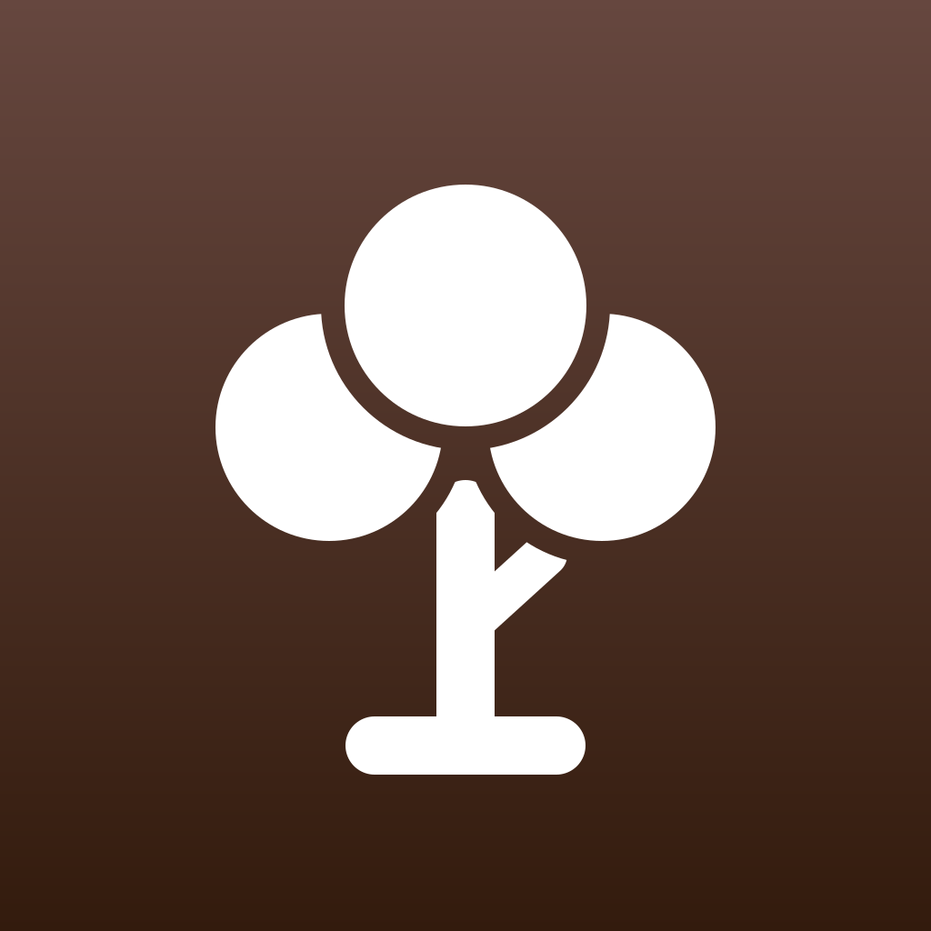 Wargi
Wargi
Colour from the app
The tile uses the app's main UI colour as a vertical gradient: lighter with a slightly shifted hue at the top, darker at the bottom.
White glyph, one weight
A 64 stroke on a 1024 canvas, inside a keyline of about 600. Overlapping parts are split by a gap in the background colour.
Specific symbols
Rice stalk, mihrab, kanban board, mind map, rosette, family tree. Not generic icons like a checkmark or an org chart.